MSc in Human-Computer Interaction, UCL.
I research user needs to design resilient systems and accessible products to serve the community.
Selected Works

Extended Abstract

Digibyte
Accepted CHI 2025
A web-based product concept using behavioral psychology theory that motivates users to reduce their digital waste by making the environmental impact of data storage visible and actionable.

Working Prototype

Accessibility Controller
Working Prototype
A customizable, ergonomic gaming controller built for a user with cerebral palsy, featuring low-force and adaptable inputs designed and prototyped within a 10-day sprint.

SaaS Website Based App

Eccho
Launched Product
An AI-powered platform that helps higher education institutions collect and manage authentic student video testimonials, without the cost or friction of traditional production.

Mobile Application

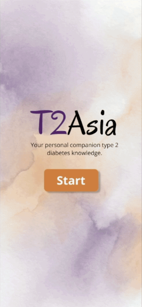
T2Asia
Academic Project
A multilingual mobile application that uses AI to help users from underserved cultural communities understand and manage Type 2 diabetes through personalized education and food analysis.

Coming Soon

Social Anxiety & Social Engineering
Submitted to SOUPS 2026
A quantitative study examining the relationship between social anxiety traits and susceptibility to social engineering attacks. Full case study details are currently withheld pending peer review protocols.
Accessible Controller for Nintendo Switch
Context: ASSIST HEIDI (UAS Technikum Wien)
Team: 5
Role: UX Researcher & Product Designer
Timeline: 10 Days Sprint
Methods: User Interviews, Rapid Prototyping, Comparative Testing, Usability Testing
Hardware Base: Sony Access Controller, Xbox Adaptive Controller
Tools: HID Remapper, 3D Printing, Soldering

The Problem:
A gamer with cerebral palsy needs a customizable input system to execute the complex, simultaneous controls required for games like The Legend of Zelda on the Nintendo Switch. The current standard controllers cause significant fatigue and exclusion because they fail to support the wide spectrum of fine motor challenges this user faces.The Solution: An adaptable, modular setup for the Nintendo Switch using the user's current technology, supplemented by 3D-printed components.
Our Process:

Our Process

User Needs & Interviews
I led the foundational research to define specific accessibility challenges, combining structured interviews with direct gameplay observation.From this interview, the pain points identified were:
- There are limited options for secondary controllers that work with Nintendo Switch.
- Buttons and joysticks are too small and difficult to use.
- Standard controllers move and shift around when being used placed on the table.
- Multiple button combinations and repeated pressing of buttons are difficult.
- User has more mobility in right arm than left, putting more strain on the right arm.Competitive Analysis:
To better understand the currently available options for users, I completed a competitive analysis:Sony’s Access Controller: A circular, modular design enabling single-handed access to multiple controls. It features re-mappable inputs and adjustable add-ons, allowing users to customize the layout to their physical needs.Xbox’s Adaptive Controller: A centralized hub featuring large, tactile buttons designed for effortless activation. It utilizes an anti-slip base with Velcro integration to ensure secure, modular mounting across various setups.I discovered that both products contained different supportive features that the user needed. However, they were available on separate products. Furthermore, other pain points were still missing such as the integration needed for Switch usage. To minimize costs, we decided to integrate the user's purchased Access Controller as part of the product.

Connection Test

3D Printing Housing

3D Printing Parts


The Engineering ProcessFeasibility & Selection: While the team explored broad concepts via "Crazy 8s," we conducted a technical feasibility analysis with professors that identified the modular controller as the only solution viable for the 10-day sprint constraint.Hardware Engineering: I supported in customizing the software and testing for the plug-and-play programmable HID Remapper for the Nintendo Switch. Furthermore, I helped in soldering standard 3.5mm jacks to modified low-force joystick modules and assembling the custom switch wiring.3D Printing & Assembly: I led the component sourcing phase to identify viable open-source assistive geometries. I then managed the digital fabrication workflow, optimizing slicing parameters and print settings to ensure the high-friction joystick covers and angle stand met the necessary durability and fit requirements.

Soldering

Progress

Labeling


Solution Details: Hover mouse over image for design details.


Remappable Buttons: Large and low-force switches accommodating limited finger strength.Velcro Board: A mounting surface that allows the controller layout to adapt and prevents user's controller movement from usage.HID Remapper: Bridge hardware limitations between Switch and controller.Angle Adjustment Stand: Reduces wrist strain tilting controller to meet user's natural arm height.Wrist/Hand Cushion: Supports the wrist during play to lessen strain on the dominant right arm.Custom Joystick: Replaces standard joysticks with a larger grip and provides tactile feedback.

Reflections:
Working within a strictly time-boxed 10-day sprint taught me the value of "strategic sourcing." I learned that relying on a passionate community of engineers, designers, and creatives is often more important in building a working solution than "reinventing the wheel."By leveraging existing open-source firmware and standard hardware modules, I could focus my energy on the unique ergonomic needs of the user rather than basic connectivity. This experience solidified my belief that the best design solution is often the one that intelligently integrates existing technologies through collective global action. Design and technology are fields where everyone can contribute, which is why it is so important to have input from all places.
Digibyte: Promoting Awareness and Habit Change for Sustainable Digital File Decluttering
Context: Accepted for CHI 2025 Student Design Competition (UCL)
Team: 5
Role: User Researcher & Designer
Timeline: 4 Months
Methods: User Interviews, Literature Review, Rapid Ideation, Think Aloud
Tools: Figma, Qualtrics
The Problem:
Data storage carries a massive physical cost. With over 50% of stored data classified as "digital waste" (redundant or obsolete files), global data centers consume an estimated 460 TWh of electricity annually while depleting community water supplies. Universities often inadvertently accumulate vast amounts of this digital data adding to the load on data centers. We asked: "How can we motivate users to declutter their digital footprint and build long-term sustainable habits?"The Design Solution: Digibyte leverages the "Ownership & Empowerment" model to turn file deletion into a positive habit. It provides a unified dashboard that aggregates physical and cloud storage, giving users a clear view of their 'digital footprint' to easily identify waste. We also replaced guilt with gratification. By translating technical metrics into relatable wins (e.g., "You saved 3 cups of coffee worth of energy"), users feel immediate agency over their environmental impact.
Our Process:

Our Process

Foundational Research: I led the foundational discovery phase, auditing existing technologies and writing the related works analysis to identify the specific market gaps our solution needed to fill.User Needs & Interviews:
To better understand the gap, I developed the research plan, using a survey (N=34) to gather broad data and personal interviews (N=5) to uncover the motivations behind the numbers.The Awareness Gap: The environmental cost of data is invisible. 84% of participants were unaware that unused data consumes energy, and 71% didn't know cloud storage generates CO2.The Emotional Toll: Poor file management causes genuine distress. Over 66% of users struggle to locate cloud files, describing feelings of "despair" and "depression" when navigating their digital clutter.

Persona 1
Persona 2


Sketches


Low-Fid

The Design ProcessThe Pivot: We started with separate mobile and email concepts ("Crazy 8s"). However, after I conducted a SWOT analysis, it was revealed neither fully supported habit formation and change we needed to effectively target the problem. We pivoted to a centralized web dashboard to unify the user's entire digital footprint. I also decided to heavily focus on behavioral change research and how it could be incorporated into features for our design.Heuristic Evaluation: Through evaluations, we identified safety risks, leading to the addition of "Deletion Confirmation" steps and other safety features for users.User Testing Strategy: I designed two rounds of testing protocols to iterate on the product. Round 1 focused on general usability, where my findings on low engagement led to the addition of "Impact Milestones." For Round 2, I created specific tasks to stress-test file sorting, uncovering friction points that directly informed the "Smart Search" redesign.Final Validation: We validated the final design using the System Usability Scale (SUS) with 15 participants. Digibyte achieved a score of 78.8, rating it as "Good/Excellent" for usability and learnability.

Mid-Fid


Sample Heuristic Evaluation


High-Fid

Design RationaleThe core architecture of Digibyte is grounded in Hungerford’s Behavior Flow Chart, moving users from passive storage to active, environmentally responsible ownership.Building "Ownership" through Centralization: We tackle "digital hoarding" by centralizing fragmented data (Photos, Documents, Email, Apps) into a single source.“Empowerment” via Positive Reinforcement: To turn a chore into a habit, we focus on the Internal Locus of Control. Positive messaging after deletion tasks reinforces the behavior.Smart Automation & Autonomy: Features like the Attachment Manager, Smart Search, and Diggy reduce the cognitive load of finding "waste."
Solution Details: Selected interaction flow. GIF optimized for high-performance loading.

Behavioral Reinforcement: Integrated "Celebration" pop-ups to reward decluttering milestones and reinforce positive habits.Visual Storage Tracking: Files are categorized by type with progress bars that visualize space usage in real-time.Organized File Deletion: Files are easy to delete through the system categorizing and filtering files that are taking up unnecessary space. Users can double-check the selection before simply pressing delete. There are undo options built in for mistakes."Diggy" AI Assistant: A chatbot that automates complex decluttering tasks through simple conversational commands.Gamified Impact: Deleting files unlocks milestones that translate "megabytes saved" into tangible environmental wins, reinforcing positive habits.
Reflections:
I learned that for invisible problems like "digital waste," just designing for usability isn't enough. Design must provide tangible visualization to support the behavioral change needed for sustainable action. Furthermore, I realized that the design process is rarely linear. I learned that taking a strategic step backward is often necessary to ensure the final design truly meets the needs of the people we are designing for.
Eccho
Context: Launched Product (Filmbright)
Team: 3 (1 Eng, 1 PM)
Role: Product Designer
Timeline: 8 Months
Methods: Surveys, Double Diamond, Heuristic Evaluations, Accessibility Audit (WCAG)
Tools: Figma, Qualtrics, Miro, ClickUp, Docusaurus
Tech Stack: HTML, CSS, JavaScript, Supabase, VS Code
The Problem:
Higher education marketing relies on authentic storytelling, yet gathering User-Generated Content (UGC) is logistically challenging. Institutions must coordinate with a diverse group of global students and alumni, leading to high costs and friction when trying to source and transfer video assets.The Design Solution: Used by institutions across the UK and USA, Eccho provides an AI-powered workflow to collect real video testimonials quickly, easily, and at a fraction of the cost of traditional production.
Our Process:

Our Process

Conception
Our goal was to design a barrier-free upload workflow that requires no account creation for contributors, maximising student participation. Students should access a seamless, high-quality video recorder without live co-ordination or third-party software.We considered two distinct interfaces within the app for two opposing personas:The Admin (Campaign Manager):Organizes the marketing campaign and prompts.The Student (Respondent): Receives the link and records their video response.A comprehensive user flow outlines the response collection process, split into five actionable stages to ensure no friction points in the user's journey.

User Flow

User Needs & Interviews
We conducted an exploratory product survey to identify key requirements for an educational video tool. Three primary needs emerged:Simple Easy Navigation: The users need a system where everything can be done within just the application and is simple to navigate.General Data Protection Regulation (GDPR) Compliant Systems: The users needs the system to be fully compliant back-end and front-end.Frictionless Student Experience: The users need the respondents (students/alumni) to be able to record and send their responses without extra steps.

Sample Database Schema

The Design Process
Ideation: I started with desktop concepts using ("Crazy 8s"). Throughout the design process, we followed the double-diamond method, using user feedback to guide our product designs and feature implementation.Data Architecture: I architected the relational database schema to support the dual-user ecosystem. To address the latency risks of heavy video content, I optimized the model for future scalability. I also embedded GDPR compliance into the system's foundation, covering everything from hosting to processing. This established a "privacy-by-design" framework with minimal data retention policies.

Low-Fi

Mid-Fi


Mid-Fi

Code-Based Prototyping: To validate complex interactions, I built functional prototypes using HTML, CSS, and JavaScript. This allowed me to test technical feasibility and refine the responsive behavior before the engineering handoff.Continuous Auditing: I conducted heuristic evaluations and WCAG Accessibility Audits at every stage. These guardrails dictated key UI decisions, including high-contrast color palettes, legible typography, and touch-target-friendly button placement.User Testing: I designed and led all our usability testing to evolve the product. Early findings on mobile friction drove a strategic pivot to a streamlined, mobile-first upload flow from the respondent end. Furthermore, I validated these changes through A/B testing, where participants after changes achieved a near-zero error rate on core tasks without guidance on both mobile and personal computers. Finally, to address specific user requests for content support, I designed the integration of a lightweight LLM for auto-generating briefs and added video transcription capabilities.Launch: Eccho launched with users based in the UK and US. After launch, we began development of an AI feature that supports users in their transcription of video answers.
Solution Details: Selected interaction flow. GIF optimized for high-performance loading.

Core Principles: GDPR compliance and accessibility were foundational to our design process, not afterthoughts. We adopted "privacy by design" to protect user data while strictly adhering to WCAG standards, ensuring the platform feels inclusive and supportive.Campaign: Initiate a new campaign to begin collecting video responses. Users can either create campaigns manually or utilize our AI assistant to generate prompts and structure.Eccho AI Assistant: Powered by Copilot, this feature automatically transcribes video content, summarizes themes, and extracts quotes for immediate use.

Consent: A submission process that requires GDPR consent but no account creation. The system collects only minimal PII (Name/Email) for organization and automatically deletes data upon campaign completion to ensure privacy.Web-Based Recorder: The recorder is fully web-based to eliminate the barrier of app downloads. Users can select prompts and record responses seamlessly on both mobile and desktop, ensuring they can contribute whenever and wherever they are comfortable.
Reflections:
Designing the database schema alongside the UI taught me that technical constraints act as the essential scaffolding that grounds the product in reality. Through this experience, I learned that understanding the "Data Model" clarified the needs of the front-end and revealed how technical limitations can productively shift design direction.Furthermore, working in a small, fast-paced team highlighted the importance of skills beyond just design. Being able to code allowed me to prototype independently, speeding up feature delivery without burdening the engineering team. Moving forward, I will continue building my coding skills to better stress-test both my designs and the systems that support them.
T2Asia
Context: Academic Project (UCL)
Team: 1 (Solo Project)
Role: UX Researcher & Designer
Timeline: 3 months
Methods: Secondary Research, Thematic Analysis, Personas, Storyboards, Wireframes, Usability Testing
Tools: Figma, Miro, Gemini
The Problem:
Type 2 diabetes carries severe health risks, but for Asian communities, the threat is compounded by factors that existing support tools routinely ignore. Asians face higher susceptibility due to distinct genetic factors and elevated risk even at lower BMIs. Alarmingly, onset is increasingly affecting younger generations, with higher associated mortality rates and a significant proportion of cases going undiagnosed.The Design Solution: A simple to use mobile application that delivered diabetes knowledge in users' preferred language and dietary guidance that respected their cultural background. T2Asia is a mobile application that personalizes type 2 diabetes education and dietary guidance for the Asian community, eliminating language barriers and addressing cultural needs.

Our Process

Foundational Research: I started my project through reading research papers and new reports on the topic of diabetes and the Asian community. I then completed auditing on existing solutions such as dietary programs. This helped me identify the specific market gaps my solution needed to fill.User Research & Findings:
To understand the specific barriers faced by Asian users, I conducted secondary research through online health forums, gathering firsthand accounts from people managing diabetes and navigating the healthcare system.Using a bottom-up Thematic Analysis approach, four key barriers emerged:Language Barriers: Significantly limited users' ability to understand GP guidance and health information, leaving them unable to act on advice they couldn't fully comprehend.Culturally Unsuitable Dietary Guidance: This led to active resistance. Users expressed distress at suggestions to abandon traditional foods, and many felt GP recommendations were too Western-centric to be realistic.Misinformation: Misinformation about food and genetics was widespread, including harmful beliefs that diabetes was inevitable or that ancestral diets provided a natural protection.Limited Understanding of Diabetes: This left users seeking basic education they couldn't find in an accessible or relevant format.

Features and Com-B


Brainstorming

Sketches


The Design Process
With research findings established, I narrowed the problem scope and developed personas, scenarios, and storyboards to guide the design direction.Ideation: From rapid ideation and sketching, I identified two overlapping concepts and combined them into a single unified solution. An initial black-and-white wireframe was developed and tested with users to observe interaction patterns and identify points of confusion.First Round Testing: Taking my initial low-fidelity design, I conducted a first round of usability testing. Taking the feedback, which focused on usability without guidance and user flow, I developed more detailed screens and introduced a second language into the prototype.Second Round Testing & Second Iteration:I conducted a second round of usability testing, this time recruiting testers who could evaluate the multilingual experience directly alongside the English version. I iterated on the design until user completion of the application without guidance was 100%.Final Iteration: For the final design, I took into consideration physical symptoms that may be caused by type 2 diabetes, such as worsening eyesight through analyzing color palettes and testing them through accessibility programs. This led to an overhaul of typography, color palette, and overall design systems.

Low-Fi

Mid-Fi

Mid-Fi 2


Hi-Fi

Design Rationale
To ensure the features I designed genuinely addressed these barriers, I applied the COM-B behavioral change model as a design framework, mapping language needs to Psychological Capability, knowledge gaps to Physical Opportunity, and cultural considerations to Social Opportunity. This kept design decisions anchored to real user needs rather than assumptions.

Features and Com-B

Solution Details: Selected interaction flow. GIF optimized for high-performance loading.
Language Selection: Language barriers were the primary research finding, so the entire app, every lesson, recipe, and label, functions in the user's chosen language.Knowledge Section: Delivers accessible, bite-sized diabetes information in multiple formats to reduce the reading burden often associated with health content.Personalized Recipes: An onboarding quiz captures user goals, dietary preferences, and cultural background to drive personalized recipe recommendations. Ingredients less suitable for diabetes management are subtly flagged, building health knowledge passively through everyday use.Food Camera: Users scan a meal or fridge contents using AI to analyze nutritional content and generate healthy, diabetic and culturally friendly recipe suggestions relevant to diabetes management.
Reflections:
Designing T2Asia as a solo project taught me that health applications demand a fundamentally different design lens. Users often engage with health technology out of necessity rather than choice, sometimes in stressful, high-stakes moments, which makes clarity and cultural sensitivity non-negotiable rather than enhancements.Working with behavioral change models required mapping every design decision to a specific dimension of the COM-B framework, which was both rigorous and rewarding. Features that only address one dimension rarely shift behavior. This project taught me to always think about long-term design decisions when it comes to an application especially in relation to health and change in lifestyle. Finally, as a solo end-to-end project, I gained valuable experience across every stage of the research and design process.
Hi again!

My journey to design started at the intersection of Psychology and Classics at UCDavis. I’ve always been fascinated by the 'logic of humans': How we think, communicate, and build systems. My early career in social impact and research exposed a recurring friction: technology that failed the very people it was meant to empower. This 'disconnect' drove me to transition into technical roles where I could act as a bridge by re-designing legacy systems to be more human-centric.

After honing my skills during my MSc in HCI at UCL, I’ve applied this human-centric approach to everything from accessible gaming hardware to Eccho a SaaS platform. Whether it’s researching user needs or refining a design, I believe technology can always be improved to create better user experiences.When I’m not at my desk, I’m likely tinkering with mechanical keyboards, drawing, out with my camera, or getting lost in a game.
